Quick Heatmap using Altair
This week I have been attending PyCon 2018 in Cleveland, OH. I consider myself to be a beginner/intermediate Python programmer, due to my relative newness in adopting the language, and how often I have to consult the documentation to make sure I’m approaching my code the right way.
One of the workshops that I attended was “Exploratory Data Visualization with Vega, Vega-Lite, and Altair” by Jake VanderPlas. It was a very informative workshop, and I found Altair could have more than a few uses at my workplaces as a visualization tool. In particular, I think it has a lot of merit in transcriptomics, where we may want to compare differential gene expression across different samples. Altair’s “selection” feature allows for one to highlight data points in a plot, and when two plots are laid out together, highlighting the points in one plot will allow for the same points to be highlighted in the other plot(s), no matter where the points are.
Anyways, I was fiddling around with Altair using some data, and I managed to make a heatmap. Altair (or rather it’s Vega underpinning I belive) has a 5000 row limit, which helps prevent Jupyter notebooks from becoming way too bulky, and so I just took the first 100 rows of the data for my sandboxing. I also had to teach myself pandas as well, which wasn’t too difficult.
First I import the necessary modules:
import altair as alt
import pandas as pd
import numpy as np
Next I read in the tab-delimited data using Pandas. Two things of note: I changed the row and column names for this data so that it’s meaningless. Also, this data has headers in the first row, so we account for that in the pandas options.
df = pd.read_csv('./gene_counts_demo.10.tsv', delimiter='\t', header=0)
df.head()
Here are the first 5 rows.
| ID | A | B | C | D | E | F | G | H | I | J | K | L | M | N | O | P | Q | |
|---|---|---|---|---|---|---|---|---|---|---|---|---|---|---|---|---|---|---|
| 0 | ID1 | 6.590024 | 5.689534 | 6.243179 | 5.869356 | 5.432451 | 5.883462 | 5.602684 | 5.615703 | 6.286978 | 5.620464 | 4.730488 | 5.165564 | 6.355769 | 6.241000 | 5.070194 | 5.429985 | 5.598491 |
| 1 | ID2 | 3.169841 | 3.169841 | 3.169841 | 3.169841 | 3.169841 | 3.169841 | 3.169841 | 3.169841 | 3.972178 | 3.169841 | 3.169841 | 3.169841 | 3.169841 | 3.169841 | 3.169841 | 3.169841 | 3.169841 |
| 2 | ID3 | 10.325336 | 10.031376 | 9.368830 | 9.991828 | 10.202978 | 9.176062 | 9.991800 | 9.879989 | 10.389802 | 9.851597 | 9.840553 | 9.846372 | 10.885074 | 10.977075 | 11.275368 | 10.855685 | 11.132452 |
| 3 | ID4 | 10.116663 | 10.288081 | 10.288910 | 10.006396 | 10.333864 | 10.152963 | 10.390633 | 9.909219 | 10.439775 | 9.802906 | 10.045982 | 9.966133 | 9.909544 | 10.210546 | 10.376105 | 10.101570 | 10.195944 |
| 4 | ID5 | 7.571120 | 7.252027 | 7.256207 | 8.003894 | 7.950876 | 8.091936 | 8.440929 | 7.874238 | 7.534125 | 7.643752 | 7.567035 | 7.617633 | 7.350477 | 7.924707 | 7.701169 | 7.422142 | 7.616505 |
In order to use all column values in the heatmap, I first needed to transform the table so that the data was easier to work with. To convert the colums into values within the table, I used the “melt” function within Pandas. Note that I commented out a numpy log2 function… I originally transformed the values into log2 to let that influence the heatmap color but the differences were not pronounced enough.
data = df.melt(id_vars=['ID'])
#data["logV"] = np.log2(data['value'])
data.head()
And here is the output of the melt transform:
| ID | variable | value | logV | |
|---|---|---|---|---|
| 0 | ID1 | A | 6.590024 | 2.720284 |
| 1 | ID2 | A | 3.169841 | 1.664411 |
| 2 | ID3 | A | 10.325336 | 3.368117 |
| 3 | ID4 | A | 10.116663 | 3.338662 |
| 4 | ID5 | A | 7.571120 | 2.920507 |
By default, the column that holds the original column IDs is called “variable”, and the values from the original row/column lookup are under the “values” column. These two column names can be modified, but I’m lazy.
To create the heatmap in Altair, I run this:
alt.Chart(data).mark_rect().encode(
    x=alt.X('variable:N', title="SampleID"),
    y=alt.Y('ID:N', title="Gene"),
    color=alt.Color('value:Q', title="Intensity")
)
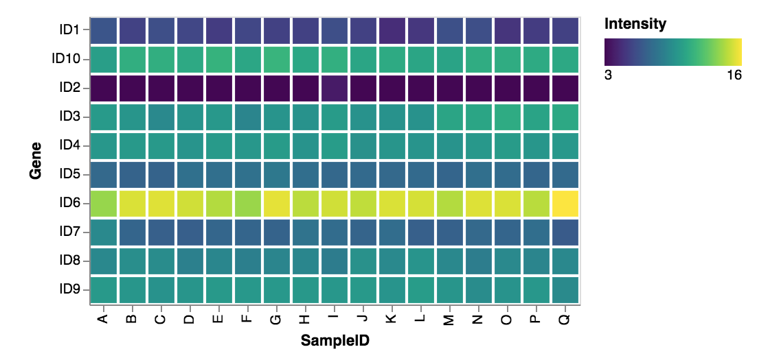
Adding “.mark_rect” tells altair to use rectangles as data points. Adding “.encode” allows you to configure the plot specifics. My x-axis is the “variable” column, and my y-axis is the ID column. For both of these, I explicitly tell Altair they are Nominal types. For heatmap coloring, I use the “values” column and make it explicitly a Quantitative type. Altair generally can infer these things, but there’s no harm in explicitly declaring the type of data.
Below is the heatmap generated. I still need to learn a bit more about Altair. ID10 should follow ID9 instead of ID1, and I have not looked up how to sort axes labels yet.

Overall I am pretty impressed with Altair. The biggest draw for me is that Altair generates the plot based on the context of the parameters provided. If I had used “.mark_point” or “.mark_bar” instead of “.mark_rect”, I would have gotten a different plot. Same goes for if I specified that my Nominal axis data was Quantitative or Ordinal (as well as changing my color data as well). This is a very handy feature for those that do not necessarily know what plot is best for their data, and this is a simpler way of generating plots too… no need to memorize and call specific plot names from a given module library, as well write long, convuted arguments. I’m looking forward to exploring Altair more in the future.